Grades Coffee Roaster
Grades is a specialty coffee roaster targeting customers who care about sourcing and roast quality, not just another café feed. The brief called for a visual system that matched the price point and the product — not a generic ‘coffee brand’ look.
The Challenge
Specialty coffee branding in the region is visually saturated — kraft bags, the same serif Arabic type, the same flat-lay shots. The challenge was to signal premium sourcing credibly without drifting outside the category’s visual language, while still standing apart from direct competitors.
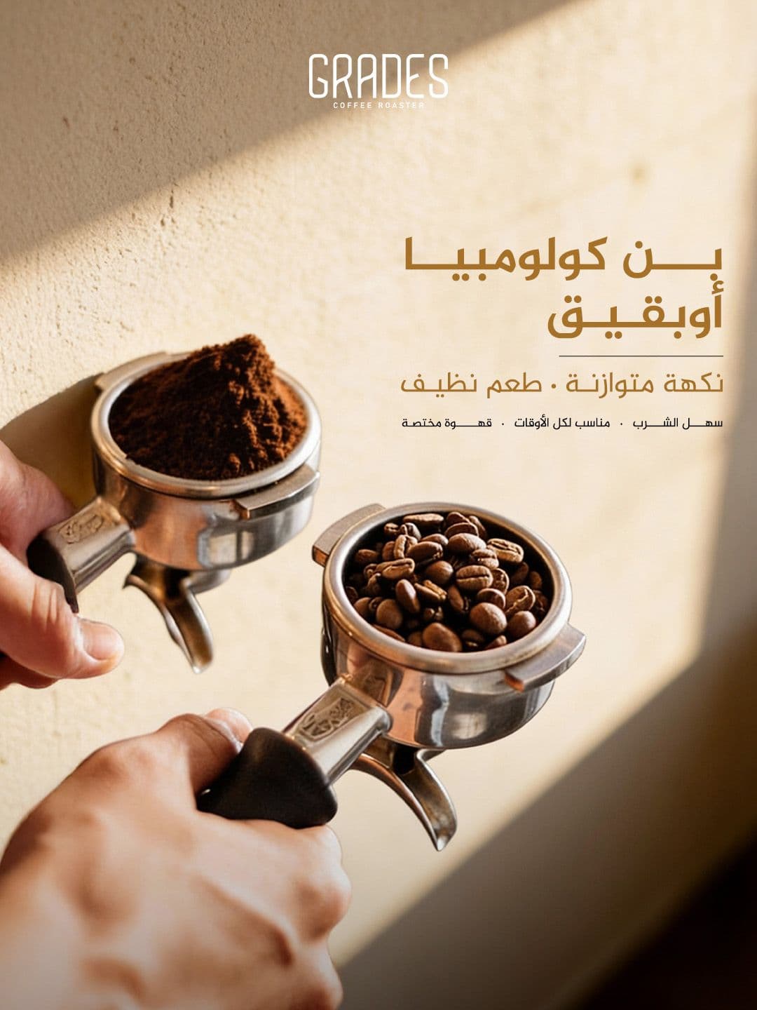
The Work
A closer look at the final deliverables.
Approach & Execution
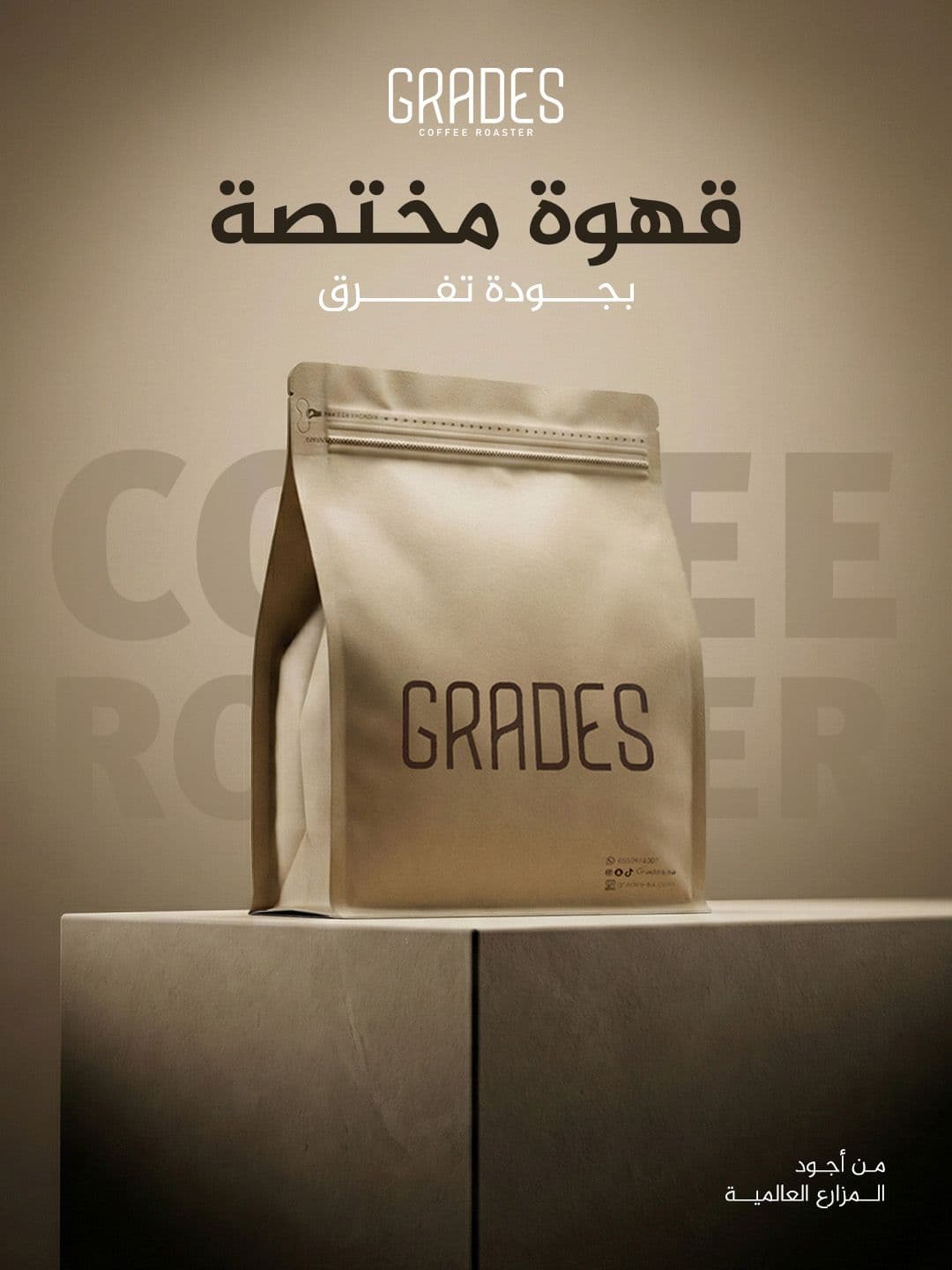
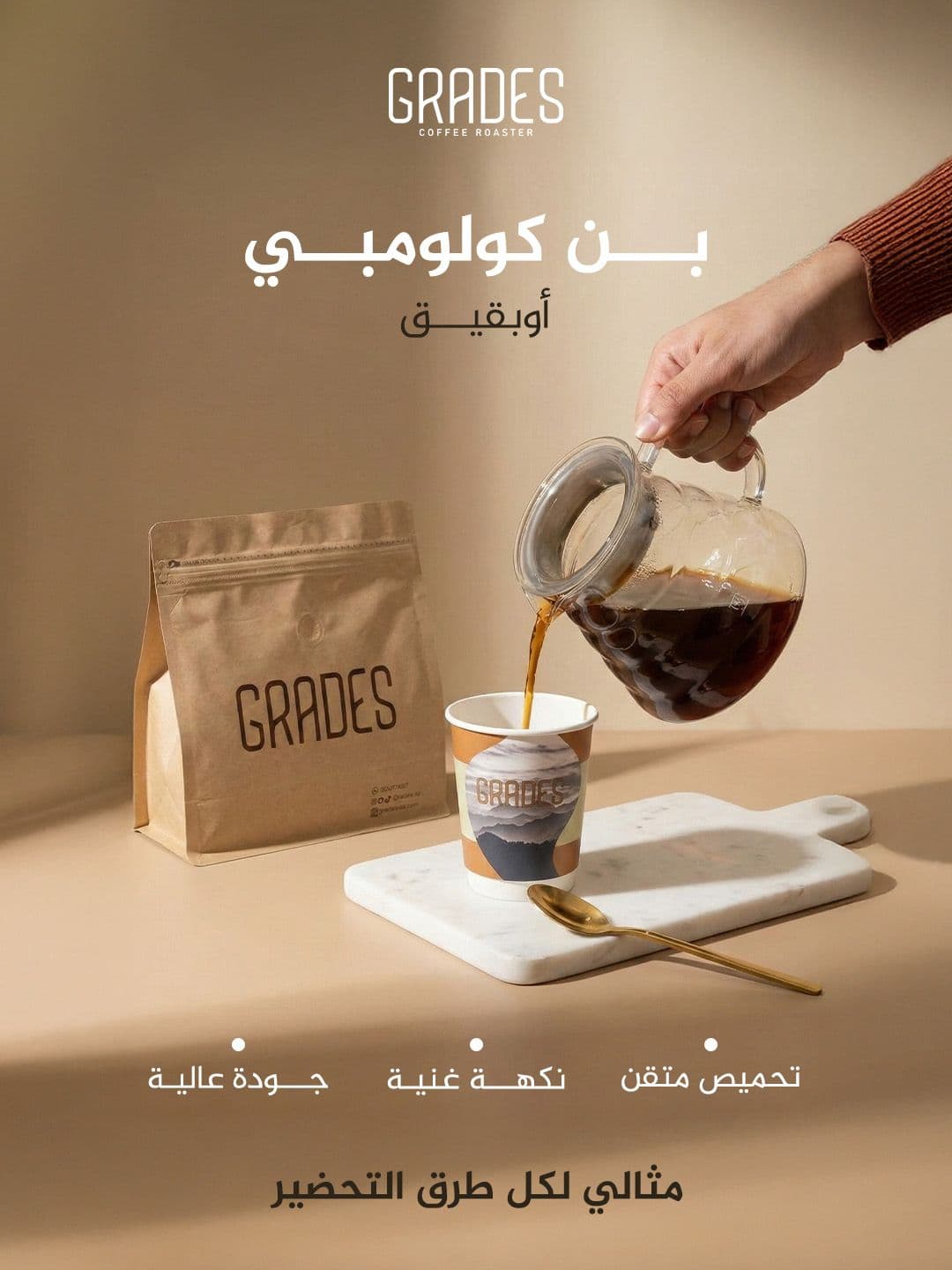
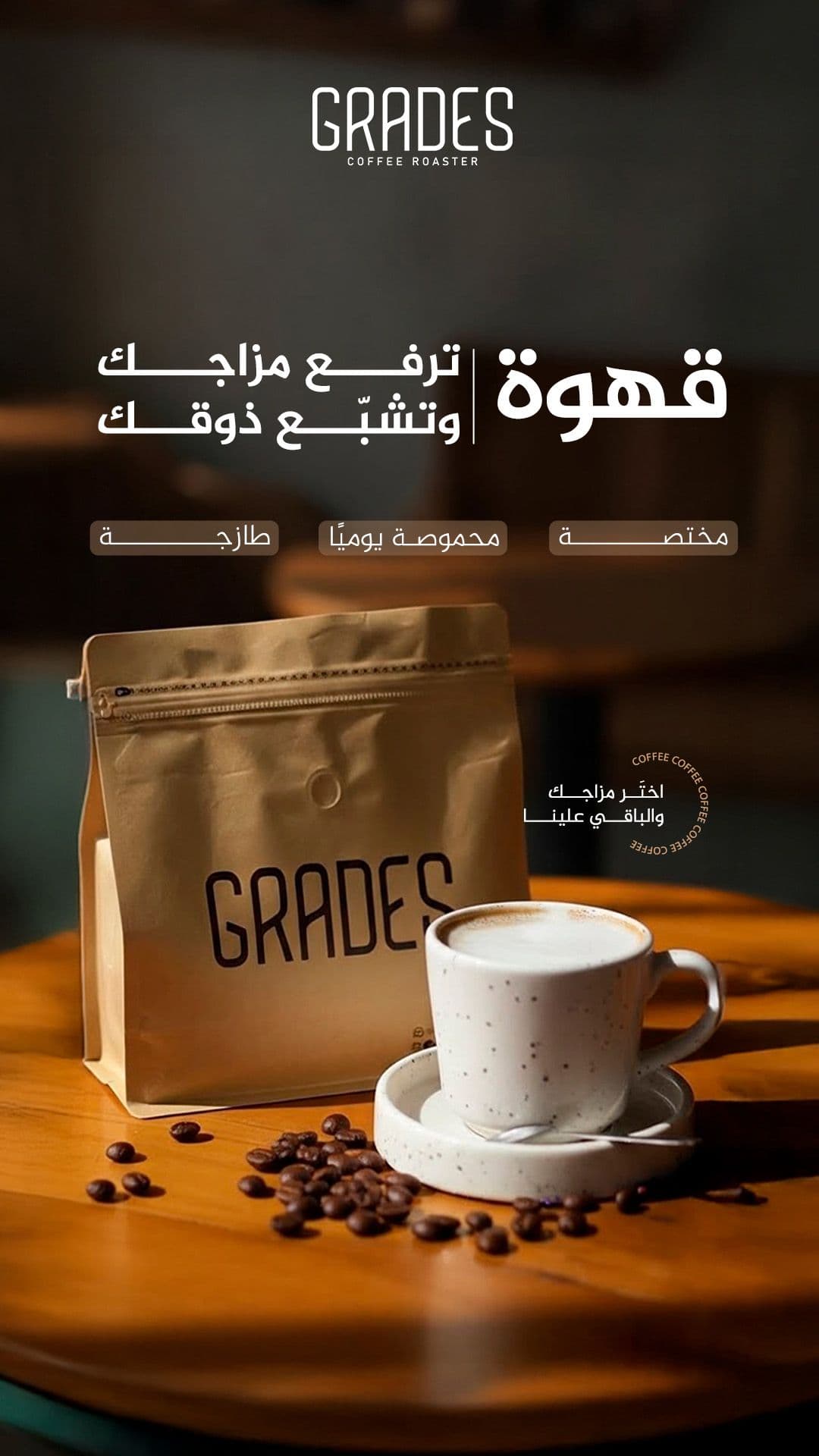
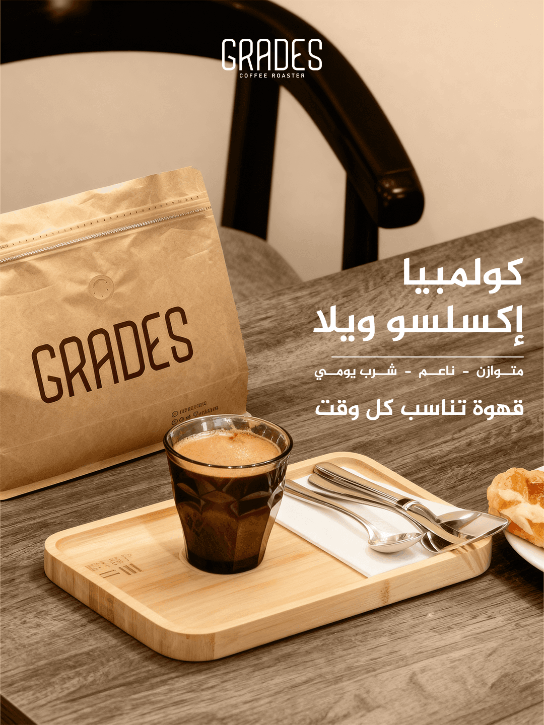
A warm, neutral backdrop was used to create a premium studio feel, with the bag treated as a standalone hero product rather than buried in prop styling. Clean Latin type for the wordmark pairs with a bold Arabic headline for immediate legibility. The whole system was built on a repeatable grid so any new SKU can be dropped in without breaking consistency.
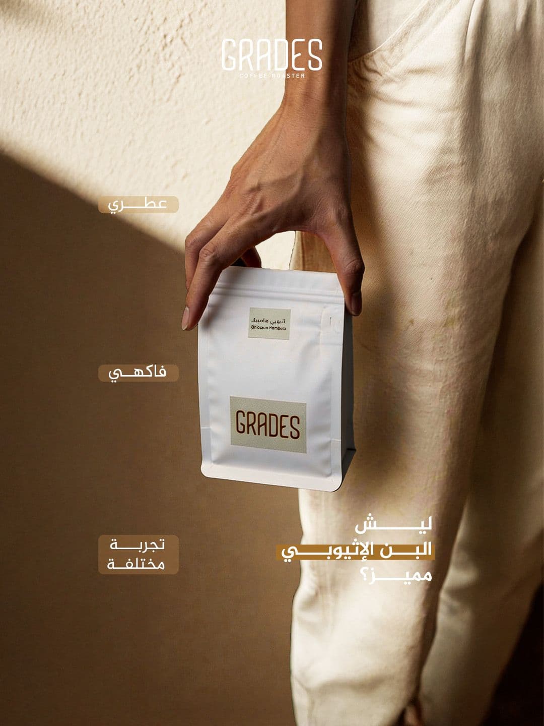
The Blend
Single-origin beans, roasted to bring out Grade's signature profile.
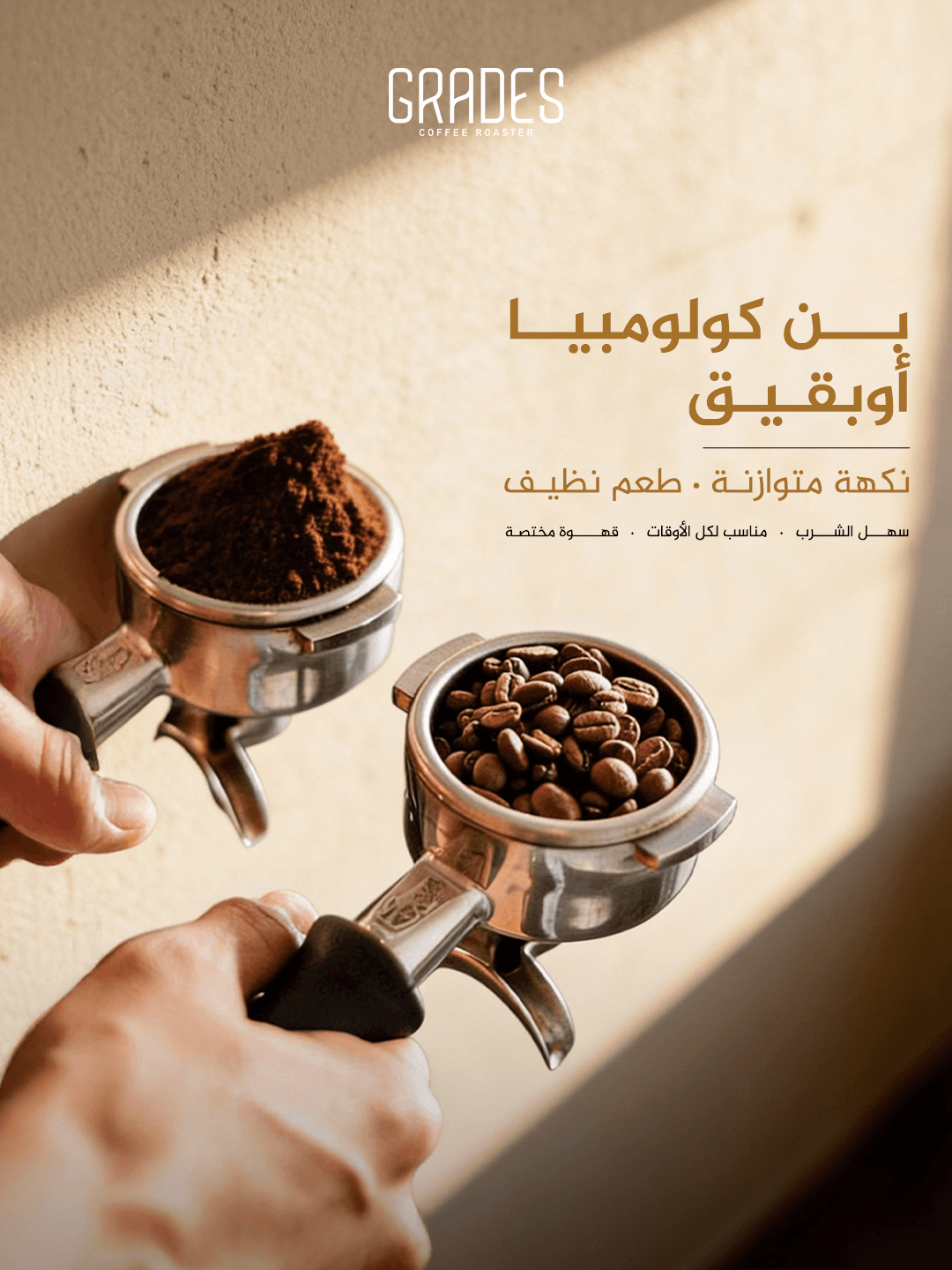
Crafted Details
Every visual element reinforces the premium roastery identity.
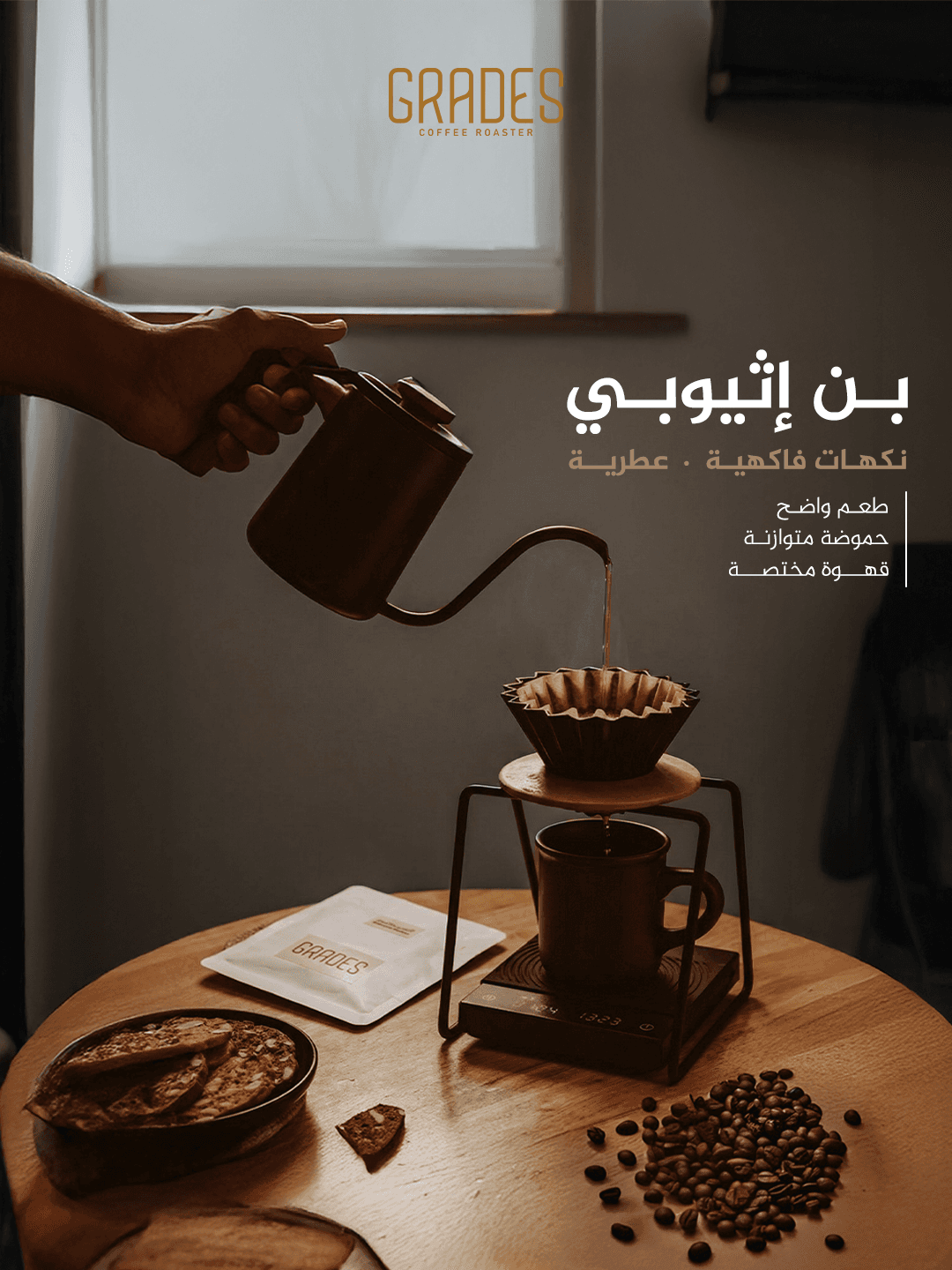
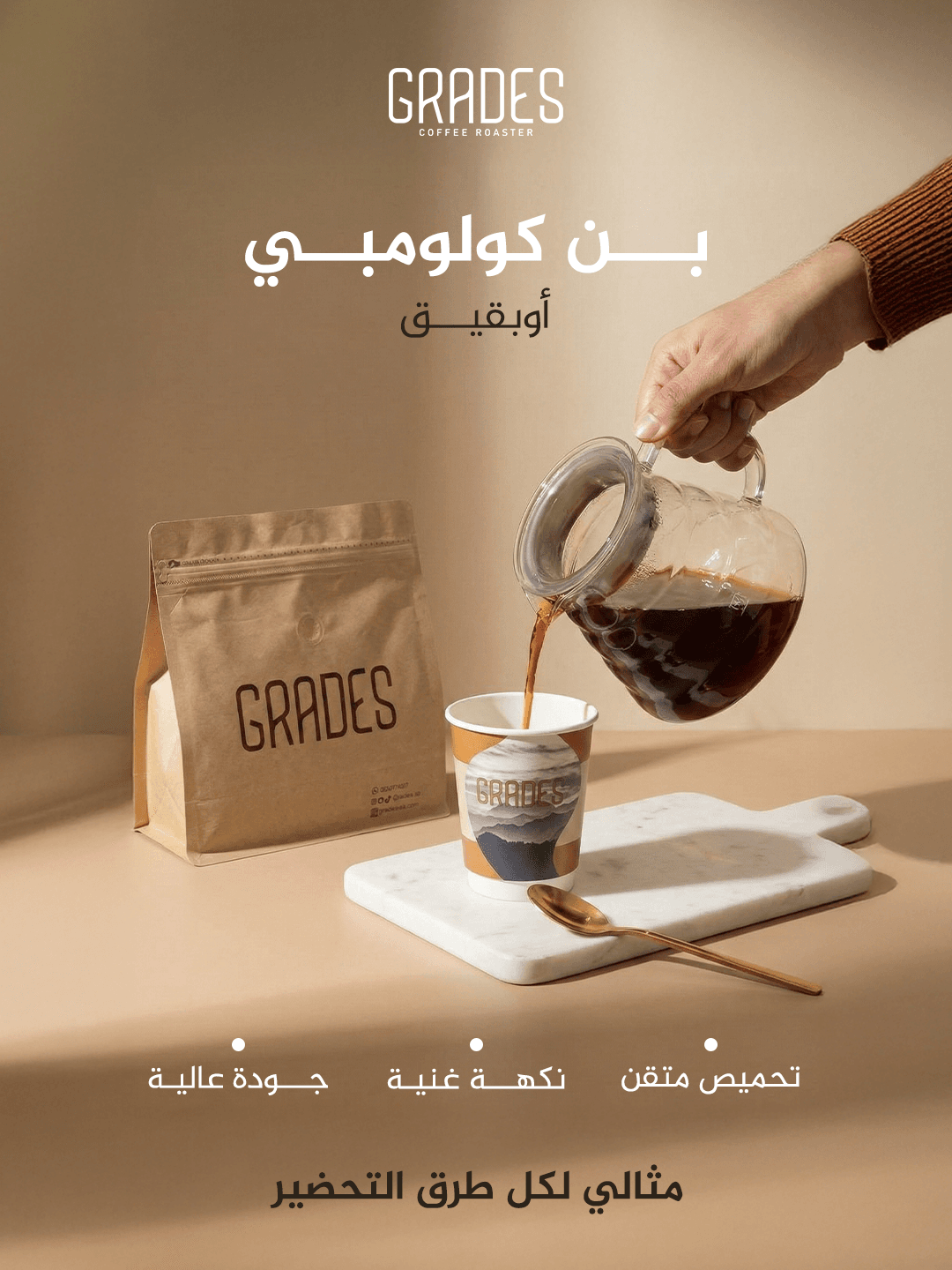
The Journey Begins
A visual series tracing coffee from origin to cup.
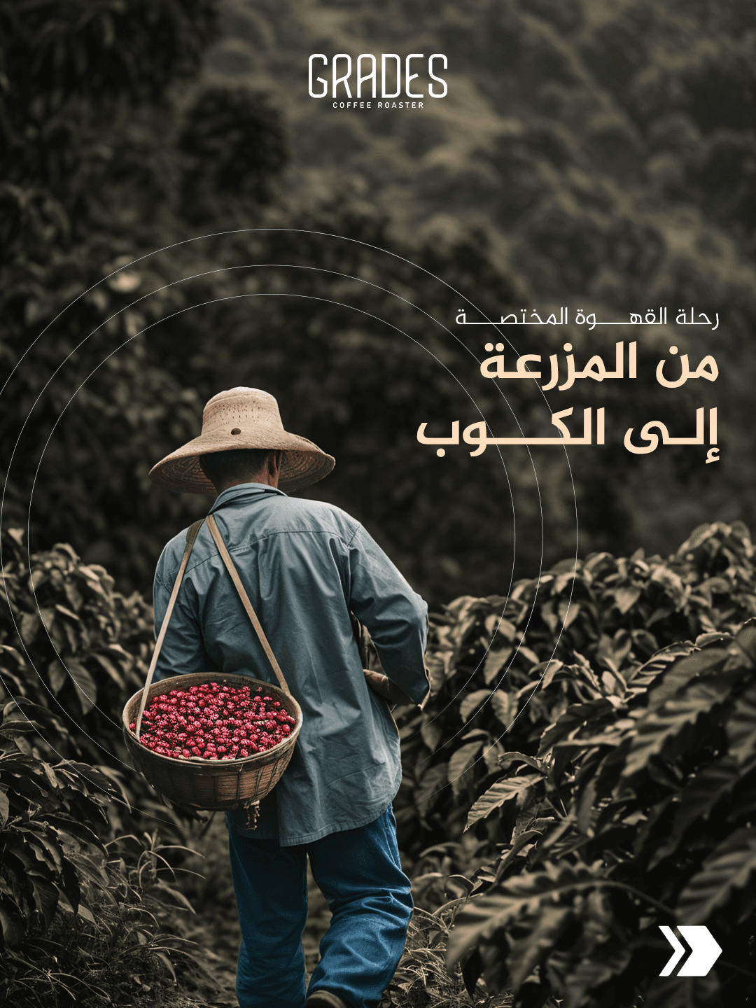
From Farm to Cup
Farming, roasting, and brewing — each step told visually.
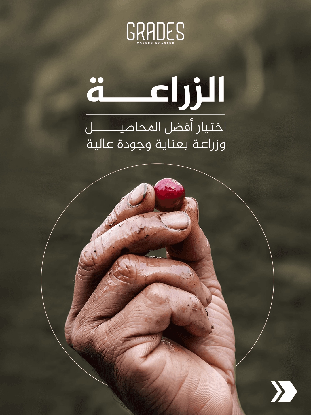
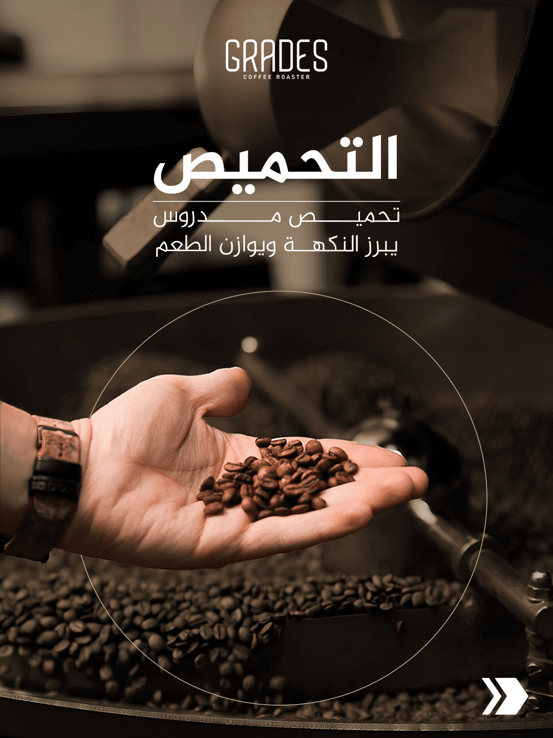
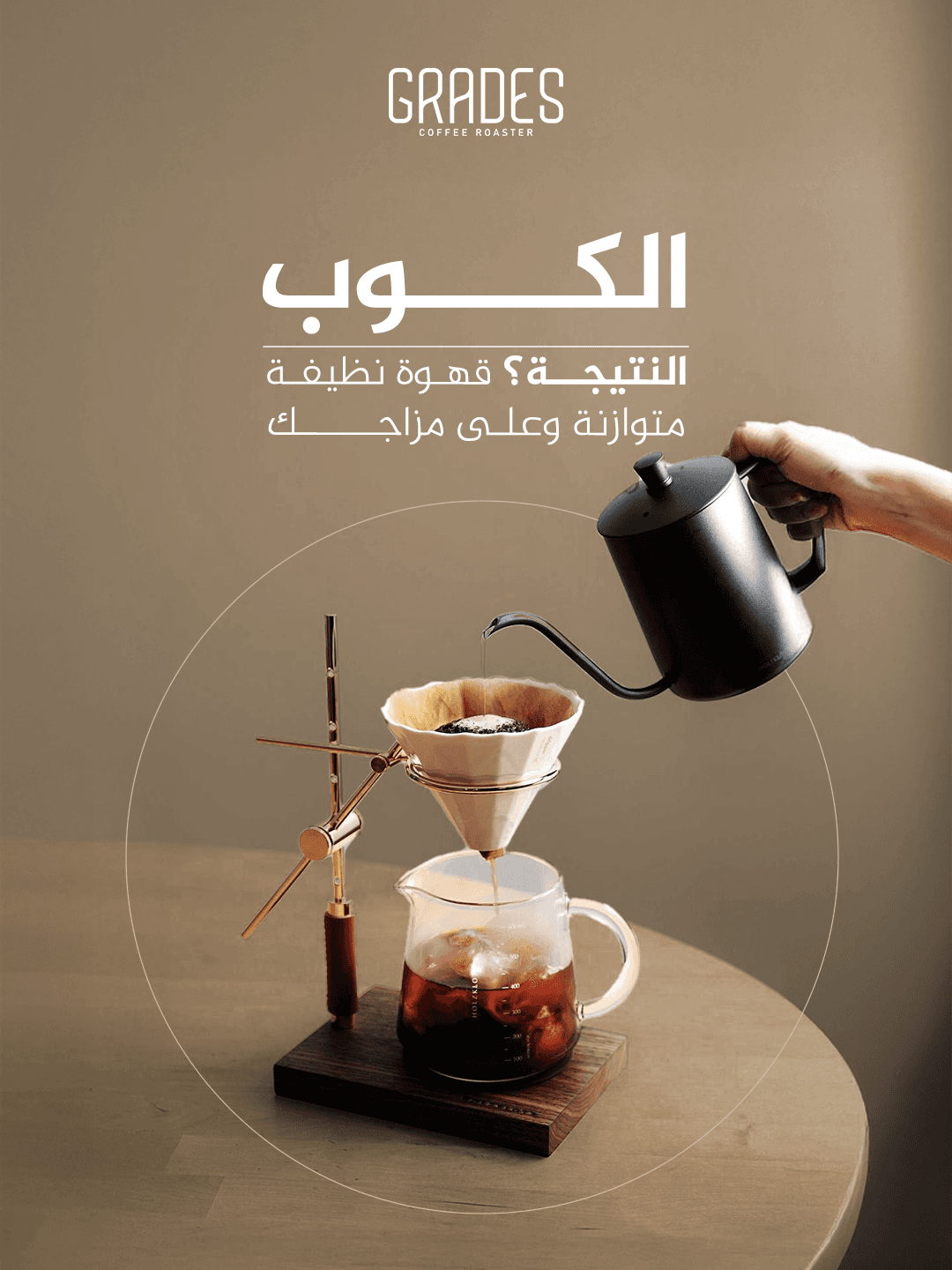
Signature Moments
Content built around the ritual of great coffee.
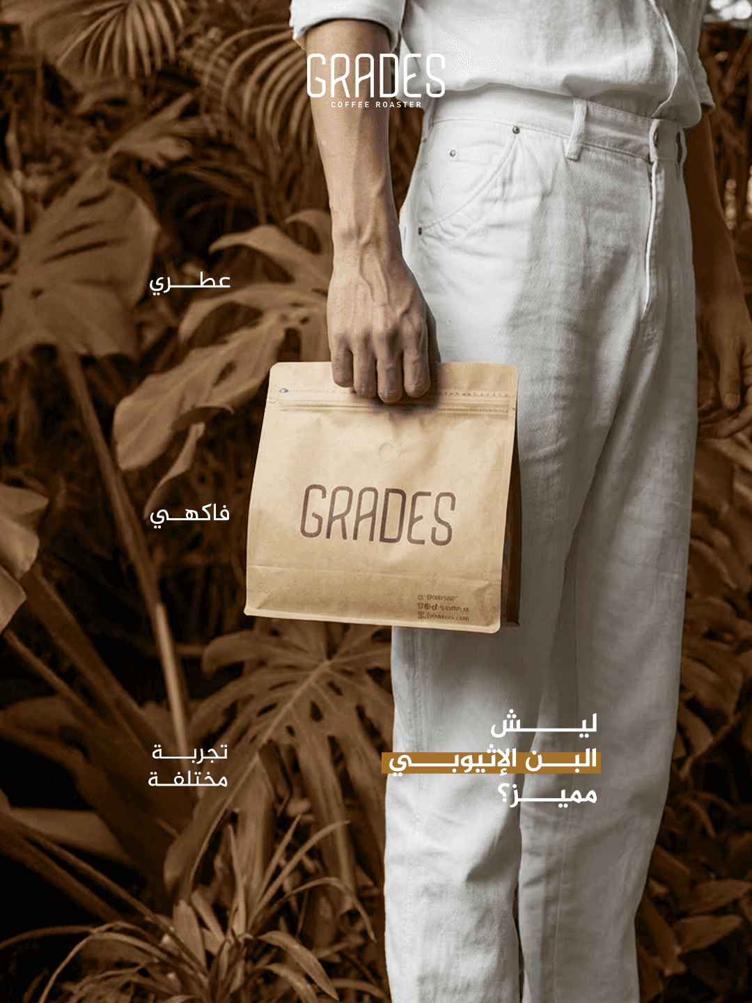
Everyday Rituals
Grade woven into daily moments, one cup at a time.
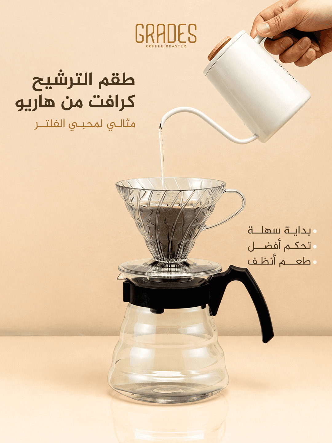
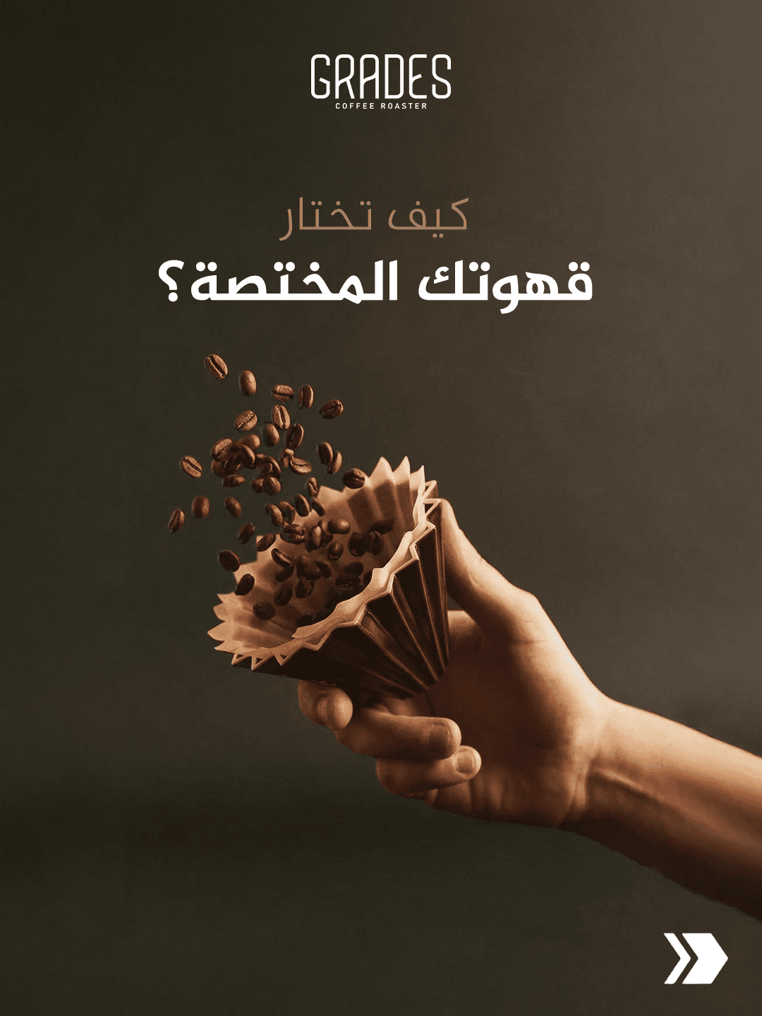
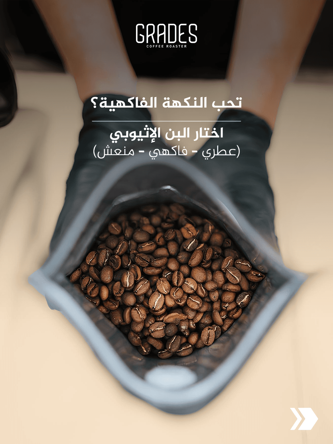
Quality in Every Detail
From bean to branding, nothing left to chance.
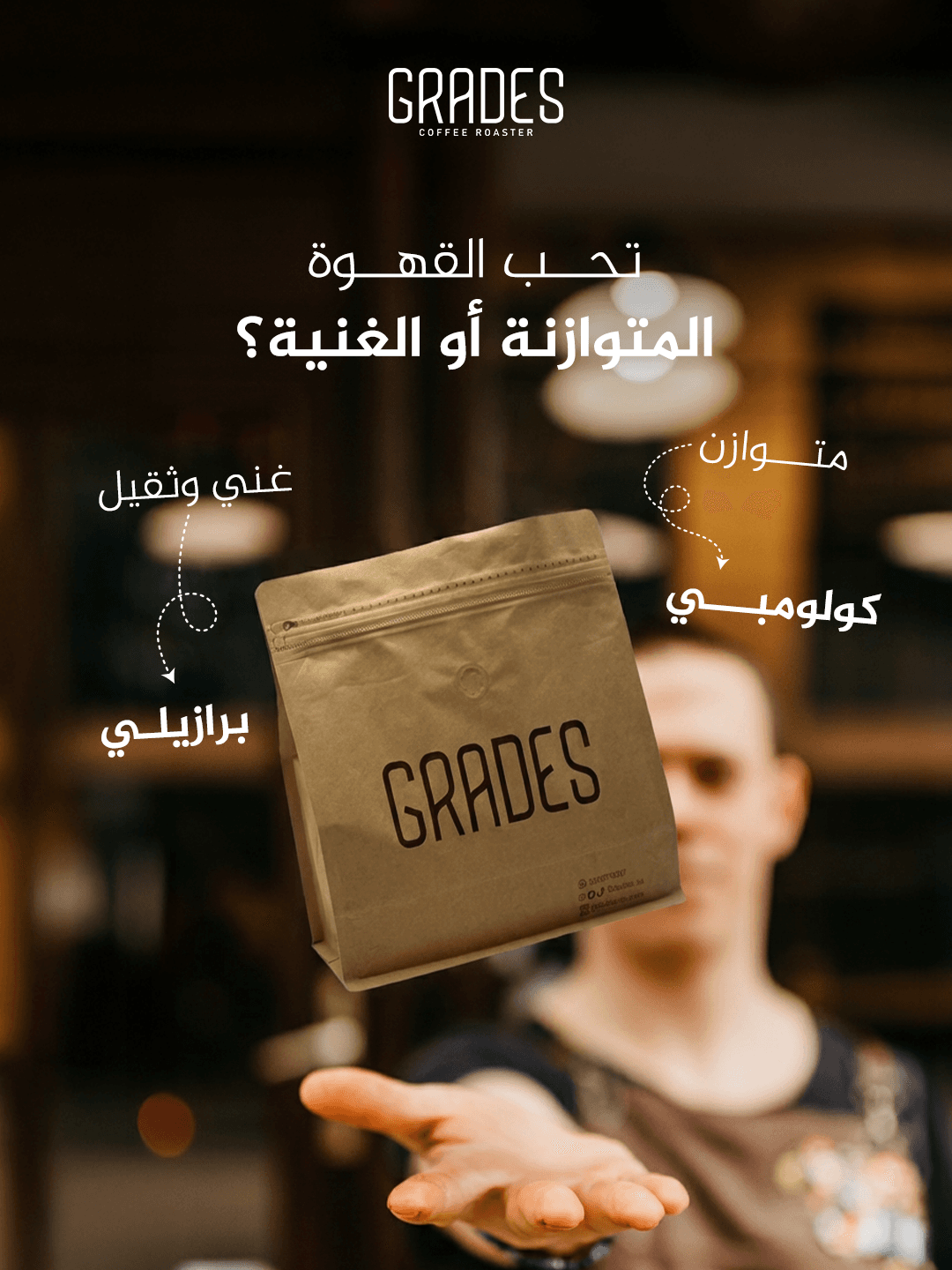
Seasonal Drops
Fresh visual concepts released throughout the year.
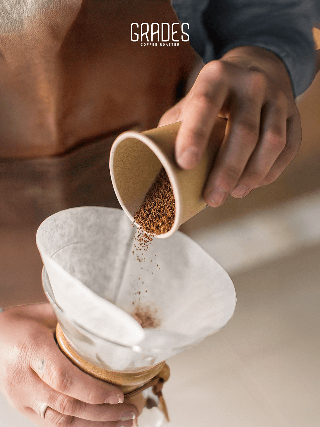
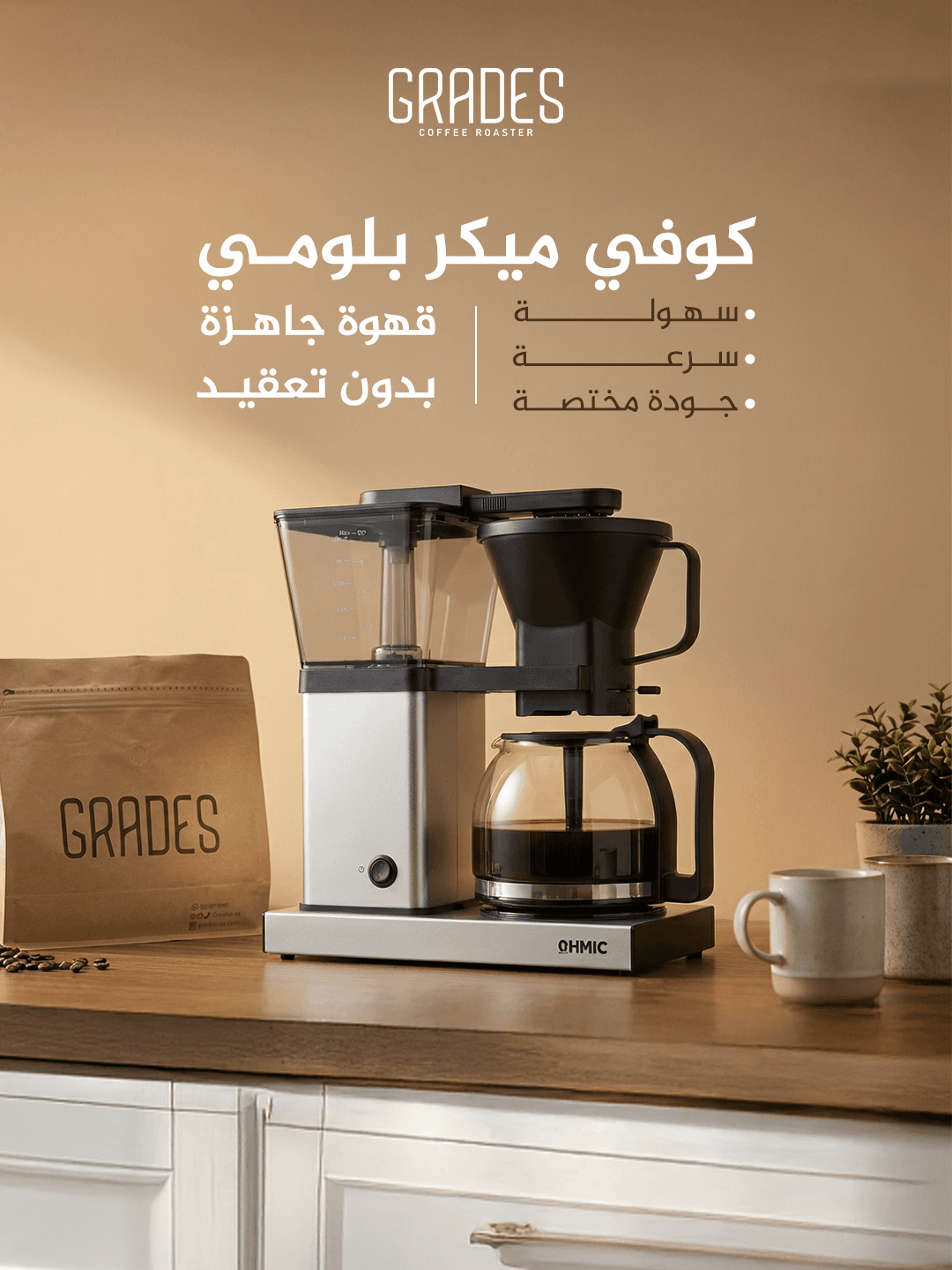
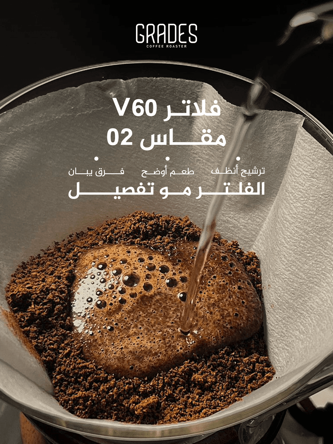
Closing the Loop
A consistent identity across every touchpoint.
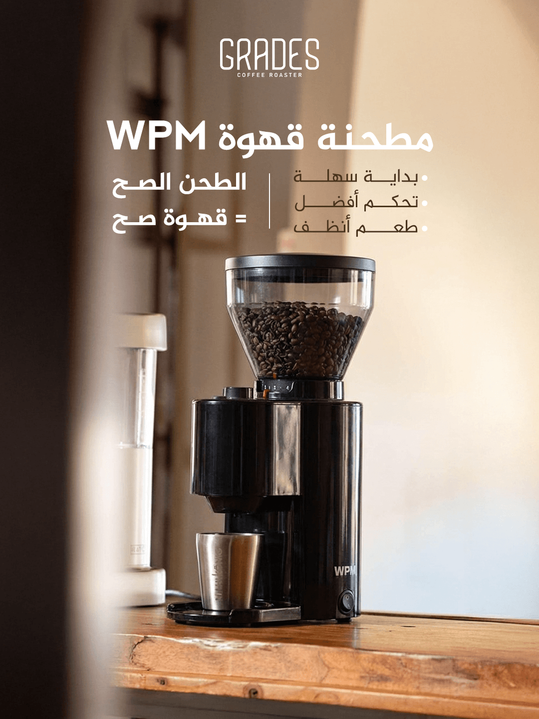
Impact
A cohesive, scalable identity that reads ‘premium’ from the first frame and extends cleanly to future product lines.
Deliverables
- Hero product presentation, publish-ready
- Instagram and Snapchat content set on the same visual system
- Print and web export files
Ready to build your visual system?
I take on a limited number of projects to keep the quality high.